It’s Spencer again. I haven’t read your entire comic archive (yet), but I have finally caught up with this story. You have a great webcomic going on here and the way you divide it into episodes makes it really easy for new readers like me. I love the concept, it’s very original.
I do have a few tips for you that may be helpful.
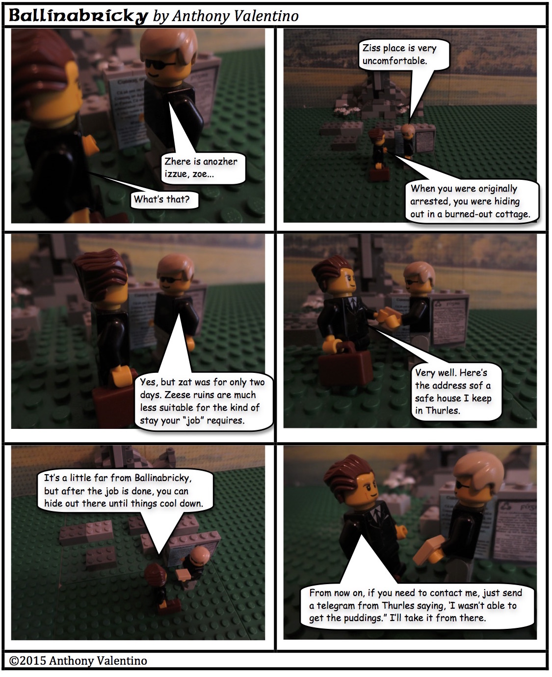
– Your dialog bubbles often cover up parts of your characters bodies like their arms, torsos and legs. This is something I see often in photography comics and it should be avoided. The dialog bubbles should never cover up any part of your characters unless it’s an out of focus character in the background. Ideally, dialog bubbles go in the negative spaces of your frames, in other words, put them in the most boring places where they aren’t covering anything up. The most ideal place for a bubble to be is at shoulder or head level of your characters toward the center. If your character is near the left side of the frame, the bubble should be on the right, if he’s on the right, the bubble goes left ideally. The exception is that dialog that is shouted is usually put up high and whispers are usually at lower torso level. When shooting your comic, you need to put negative space between the characters and around them so you can fit your dialog bubbles in the frame. Dialog bubbles should also never leave the panel unless the dialog is supposed to trail into the next panel.
– A lot of your pictures are at a top down angle, which is fine. However, in top down angle shots, you have to be very concerned about lighting. In this very page, for example, look at the second to last panel. The shadows cast in the bottom left of the frame are much too harsh and look ugly. At a flat angle, shadows like that can look interesting, but you want to avoid shadow blotches like that in overhead shots.
Good suggestions, thanks. I thought the shadow in this case seemed to add a sense of ominousness, else I would have put the dialog over it and not covered the more interesting part of the background. Guess I called that one wrong.
I do need to be more mindful when I’m taking the pictures of leaving space for the dialog. Sometimes, I find that some of my longest dialog bubbles happen in my most cramped interior spaces. In my earliest stories, I kept the dialog much shorter, but I felt this had an adverse effect on the pacing, so I started making individual episodes in which more stuff happened.
Lately, I’ve begun experimenting with some larger panels (If you’re following along my guest strip at bricksofthedead.com, you will see some examples there. Those larger cells will give me more space for longer dialog.
I do create my episodes many months in advance, so it may take a bit before new techniques show up (this story is already locked and loaded and running until the end of August), but I am indeed making an effort to always improve my techniques.
For instance, I think I’ve gotten much better with conveying night photos than I was in The Travail Of Passion, and with interior shots than I was in Riders To The Sea. I’m also trying to improve my bubble placement for a natural order (which comes first and which comes second). I think I’ve gotten better at that than I was, but I know there are still some panels from time to time that don’t read as naturally as I’d like. I do try to keep the bubbles within the cell borders, but I occasionally permit them to nudge out just a tiny bit (not into the other picture, just sitting on the border line) — that’s another concession to not having left enough space when photographing, but working with some larger panels in the future should alleviate the need to do that.

It’s Spencer again. I haven’t read your entire comic archive (yet), but I have finally caught up with this story. You have a great webcomic going on here and the way you divide it into episodes makes it really easy for new readers like me. I love the concept, it’s very original.
I do have a few tips for you that may be helpful.
– Your dialog bubbles often cover up parts of your characters bodies like their arms, torsos and legs. This is something I see often in photography comics and it should be avoided. The dialog bubbles should never cover up any part of your characters unless it’s an out of focus character in the background. Ideally, dialog bubbles go in the negative spaces of your frames, in other words, put them in the most boring places where they aren’t covering anything up. The most ideal place for a bubble to be is at shoulder or head level of your characters toward the center. If your character is near the left side of the frame, the bubble should be on the right, if he’s on the right, the bubble goes left ideally. The exception is that dialog that is shouted is usually put up high and whispers are usually at lower torso level. When shooting your comic, you need to put negative space between the characters and around them so you can fit your dialog bubbles in the frame. Dialog bubbles should also never leave the panel unless the dialog is supposed to trail into the next panel.
– A lot of your pictures are at a top down angle, which is fine. However, in top down angle shots, you have to be very concerned about lighting. In this very page, for example, look at the second to last panel. The shadows cast in the bottom left of the frame are much too harsh and look ugly. At a flat angle, shadows like that can look interesting, but you want to avoid shadow blotches like that in overhead shots.
Good luck :3
Good suggestions, thanks. I thought the shadow in this case seemed to add a sense of ominousness, else I would have put the dialog over it and not covered the more interesting part of the background. Guess I called that one wrong.
I do need to be more mindful when I’m taking the pictures of leaving space for the dialog. Sometimes, I find that some of my longest dialog bubbles happen in my most cramped interior spaces. In my earliest stories, I kept the dialog much shorter, but I felt this had an adverse effect on the pacing, so I started making individual episodes in which more stuff happened.
Lately, I’ve begun experimenting with some larger panels (If you’re following along my guest strip at bricksofthedead.com, you will see some examples there. Those larger cells will give me more space for longer dialog.
I do create my episodes many months in advance, so it may take a bit before new techniques show up (this story is already locked and loaded and running until the end of August), but I am indeed making an effort to always improve my techniques.
For instance, I think I’ve gotten much better with conveying night photos than I was in The Travail Of Passion, and with interior shots than I was in Riders To The Sea. I’m also trying to improve my bubble placement for a natural order (which comes first and which comes second). I think I’ve gotten better at that than I was, but I know there are still some panels from time to time that don’t read as naturally as I’d like. I do try to keep the bubbles within the cell borders, but I occasionally permit them to nudge out just a tiny bit (not into the other picture, just sitting on the border line) — that’s another concession to not having left enough space when photographing, but working with some larger panels in the future should alleviate the need to do that.